
This is a student capstone project that I completed for DesignLab's UX Academy where I was assigned to design an end-to-end app mobile app. The app that I designed is a type of "Yelp" for parents to find kid-friendly places online.
Parents have a hard time finding kid friendly restaurants and entertainment when searching online. They have to comb through websites, reviews, pictures, and sometimes even resort to contacting a business to make sure that it is an appropriate place to bring their children.
UX Designer
Figma
October 2022 - March 2023
The first part of my UX research involved a competitive analysis of other businesses to understand what's currently out there and possible gaps in the market.
Another part of my UX research was conducting interviews. I needed to hear from real potential users of my app to understand their frustrations when searching for kid-friendly places online. I interviewed five people and I organized the data through affinity mapping.
I worked through important quotes and insights and started to see that there were certain features or amenities that were on the users' mind.
All of the interviewees had similar backgrounds, needs, and pain points, so I developed a persona named Lauren to emulate them. Referring to this persona led me to align the problem I wanted to solve and my proposed solution with the actual users in mind.
Some of the issues that parents faced were information overload, inconvenience, and lack of information so I developed several HMW questions to explore these areas:
These questions became the actual problems I decided to solve for my users.
Since I was designing the app from scratch, I had to make sure I included the features that users expect of an app and features that would help solve their problems. I also had to prioritize which new features I should include now and which I should include later. All of the features I noted were based on research I had done.
I also drew up task flows to show what actions users can take on the Tiptot app and the overarching steps they would need. I decided on these task flows because I thought they were important ways to show how convenient and easy it is to use the app to search for kid-friendly places or events online.
Because this is a new app, I needed to figure out the location of each feature and component to help users easily navigate through the app. It was important to write it out so I can see if my organization made sense.
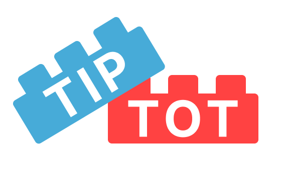
I wanted the app to feel bright and fun. I shaped the logo into legos to give a playful feel and I felt the contrast of bright red and soft blue gave contributed to the playful mood. I also decided to name the app TipTot:
In designing the low-fidelity wireframes, I made sure to include key screens that I wanted to later test in a usability study. I kept the task flows and site map in mind as I designed the screens for each step of the process. It was important that I made the steps convenient for parents and that I highlighted kid friendly amenities as these were some of the pain points that the users had.


As I iterated on the designs to create a high-fidelity prototype, I incorporated the brand's logo, colors, and fonts to make it come to life. I used a lot of pictures to draw parents in to view a listing. I also connected the screens to make a working prototype that I wanted to test with real users.


I wanted to test the prototype to make sure that users can complete the task flows I've designed on the app. I had 10 participants complete an unmoderated usability study through Maze.co.

The revisions I had to make after the usability study were few. I mainly fixed the issues with icons and colors.

.png)
There was a difference in opinion between the users about which search filters were needed and which weren’t. In the future, I want to do A/B testing to see which filters works best for most users. I would also like to improve on the app by designing and testing the “ideas” and “questions” sections in the Feedback Grid. In addition, I would like to partner with a developer to bring the app to the market for parents to use.
I should’ve done the usability study in person, so that I can catch issues with the the prototype earlier. When I tested the prototype on Maze.co, it seemed fine, but there were glitches in the testing site and prototype that I didn’t discover after I reviewed the results of the study. However, I am glad that I took an additional course on UI design while working on this project as I was able to improve the visual aspects of the app compared to my last project.


.png)


